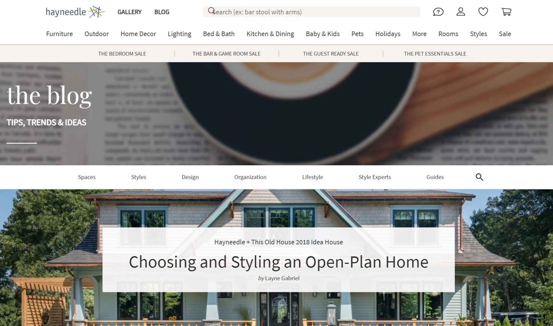
Using the This Old House 2018 Idea House for inspiration, Sweenor Builders’ Interior Designer Kristen Martone sits down with leading online furniture and décor retailer Hayneedle to share her tips for designing an open floor plan.
Hayneedle: How was this home concepted? What were the important elements to include?
KM: Designed as an Idea House, the guiding concept throughout our project was to showcase all the things that top homeowner wish lists today. You can see this reflected in the first-floor open floor plan, the easy-to-care-for “staycation” backyard design, the inclusion of laundry facilities on the first and second floors, and the efficient use of space throughout the home — enabling two ensuites, two additional bedrooms and a private guest suite above the garage.
Hayneedle: What are the pros and cons of an open plan?
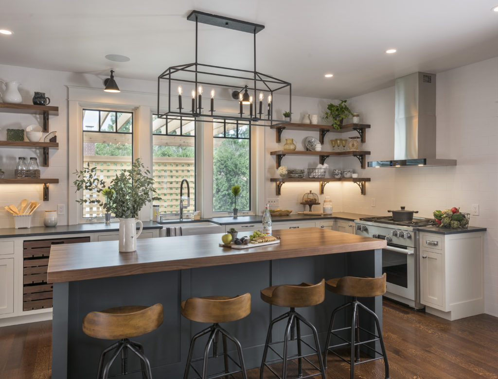
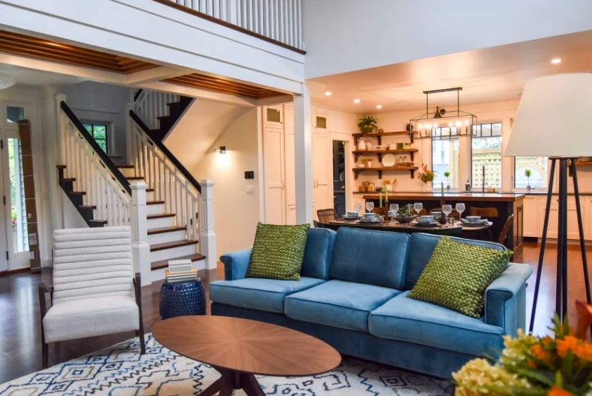
KM: Open floor plans – especially with a two-story living room like we incorporated in the Idea House – lend a sense of expansiveness to a home and allow you to bring in more natural light. Many of our clients like the easy flow that open floorplans create in the heart of the home. You can achieve a social cohesiveness even when family members are engaged in different activities. Using the Idea House as an example… Mom could be cooking in the kitchen, Dad watching the news in the living room, and one of the kids doing homework in the library. Open floorplans also help you take advantage of square footage more efficiently, and they are well-suited for entertaining.
Downsides are that it can be harder to carve out a space for peace and quiet in an open floor plan. Many of our clients who have busy families also worry that it will be harder to hide “the mess” that comes with their active lifestyle. There is no question that sound travels in open areas, and there isn’t as much privacy as you will find with distinct rooms. So, we created plenty of space outside the open living area for getting away in the Idea House. There are multiple bedrooms, a private media room in the basement, and an additional and completely distinct living space above the garage. To minimize clutter in the open living area, we created a drop-zone and mudroom with storage compartments at the entry nearest the kitchen. There is also a traditional coat closet with shelving in the front foyer. And, we built a hard-working pantry just off the kitchen that provides ample storage and out-of-sight work areas, including laundry and a country sink.
Energy costs are a final consideration. Open floorplans enjoy more natural light and help to increase air ventilation. These factors can help to drive energy and cost efficiencies. However, this can change when you introduce a two-story open floor plan. The climate that you live in is key. When heat rises in colder months in places like New England, for example, you’re likely to see heating bill increases to make up the difference. Whereas the natural light gained during cooler months in a city like Atlanta may make the seasonal change seem negligible.
Hayneedle: How do you determine if an open plan is right for you?
KM: Every family is different. We start each project by first gaining an understanding of how our clients really live, and how they want to experience their homes in day-to-day life. From there, we can customize the right design solution. Open floor plans are experiencing a surge in popularity right now for the reasons we’ve already mentioned, but there are some people who will prefer a more formal approach with a separate living room and dining room. I encourage people to talk with building and design professionals early in the design concept phase, when they can make the greatest impact. It all begins with a conversation. There are almost always creative solutions available to help you take the things you like about a particular design approach, and then address the aspects that are less appealing to you.
Hayneedle: How do you style an open plan home to differentiate each room space?
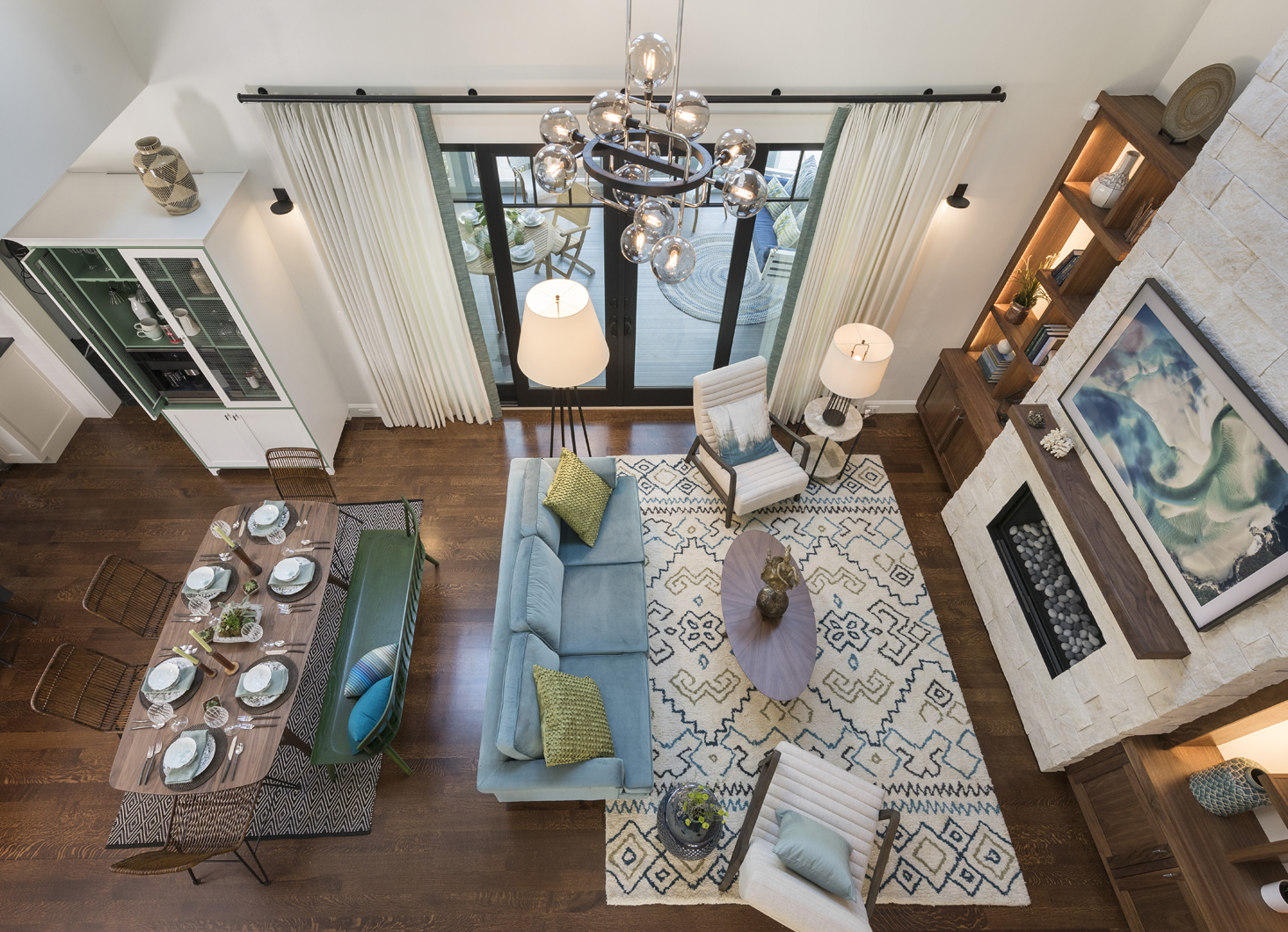
KM: Transitions between different rooms or functional areas within an open space are key. This is one of the most important areas where having a talented design professional onboard will help. In the Idea House, custom cherry-tray ceiling inserts separate the foyer from the living room and establish an egress pattern to the stairs, kitchen, and first floor master bedroom. It subtly creates the feeling of a hallway or corridor, but without walls! The oak floor in the foyer features a herringbone pattern outlined by a contrasting black walnut inlay to define the space. A column and custom built-in beverage bar help distinguish the dining area from the living room and kitchen. And, over-sized sliders in the living room maintain open site lines to the adjacent 3-season porch, while a subtle shift from a white ceiling to natural cedar gives each space a distinct personality.
Hayneedle: Tell us a little more about how you picked the furniture and décor.
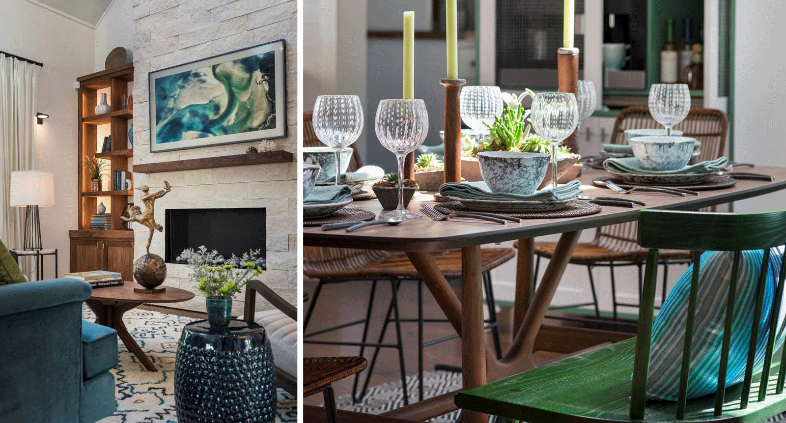
KM: The function of each room guides me on the selection of furniture pieces, fabric types, and style choices. I often start with one focal point and build around it. Using the living room at the Idea House as an example, I began with the blue sofa and then started to build, bringing in accent chairs and an area rug to create and ground a cozy conversation space. The coffee and occasional tables were selected to give end users easy places to put down a book or a drink, and so on. The placement of the couch was also important as it helped create a transition from the dining to living space.
Hayneedle: What would you call the style of décor?
KM: We were inspired by mid-century modern design in many of our décor choices. The mid-century modern movement was founded on the idea that form follows function. The simplicity and practicality in these pieces felt like the perfect answer to today’s busy, complex world. Mid-century modern design also shares some overlap with the history of craftsman style homes, and it was important for us to approach the interior spaces in a way that would feel synergistic with the exterior.
Hayneedle: What are your favorite elements in each room?
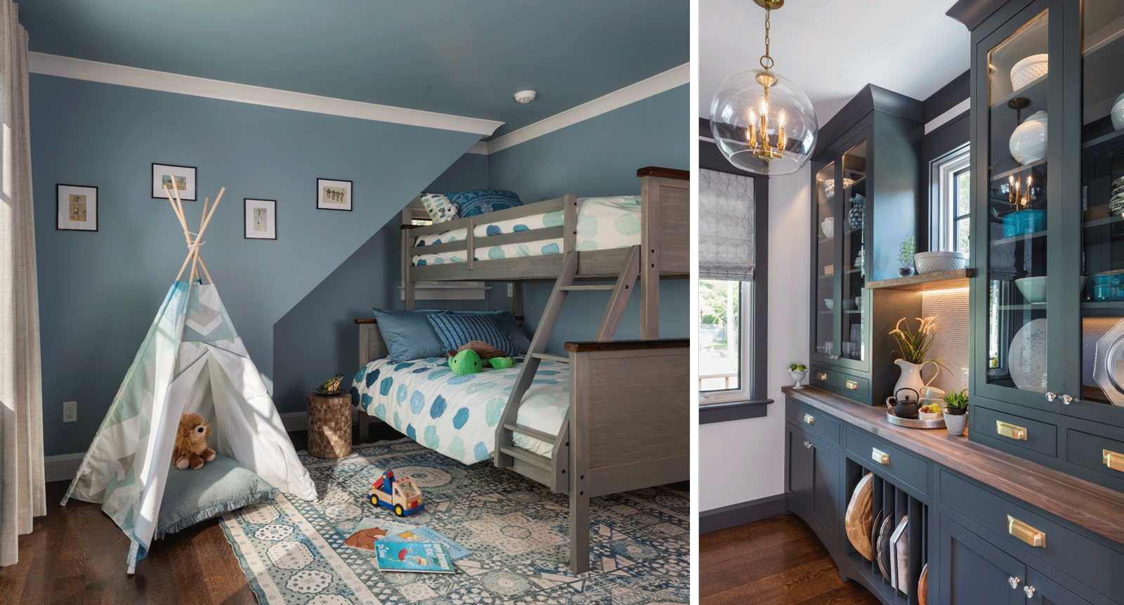
KM: The unique craftsmanship details are always one of my favorite ways to make a home feel special. We approach these elements with the understanding that they need to stand the test of time. The cherry-tray inserts, the stone fireplace with custom walnut bookcases flanking each side, and the cedar trusses in the living room ceiling all stand out for me. Another favorite is the cobalt blue bookcase in the library which we created by reclaiming 11-foot doors from an old hotel that had closed. We used the grills and reimagined the pattern, added a serious pop of color and modern gold confetti wallpaper to line the back shelving.
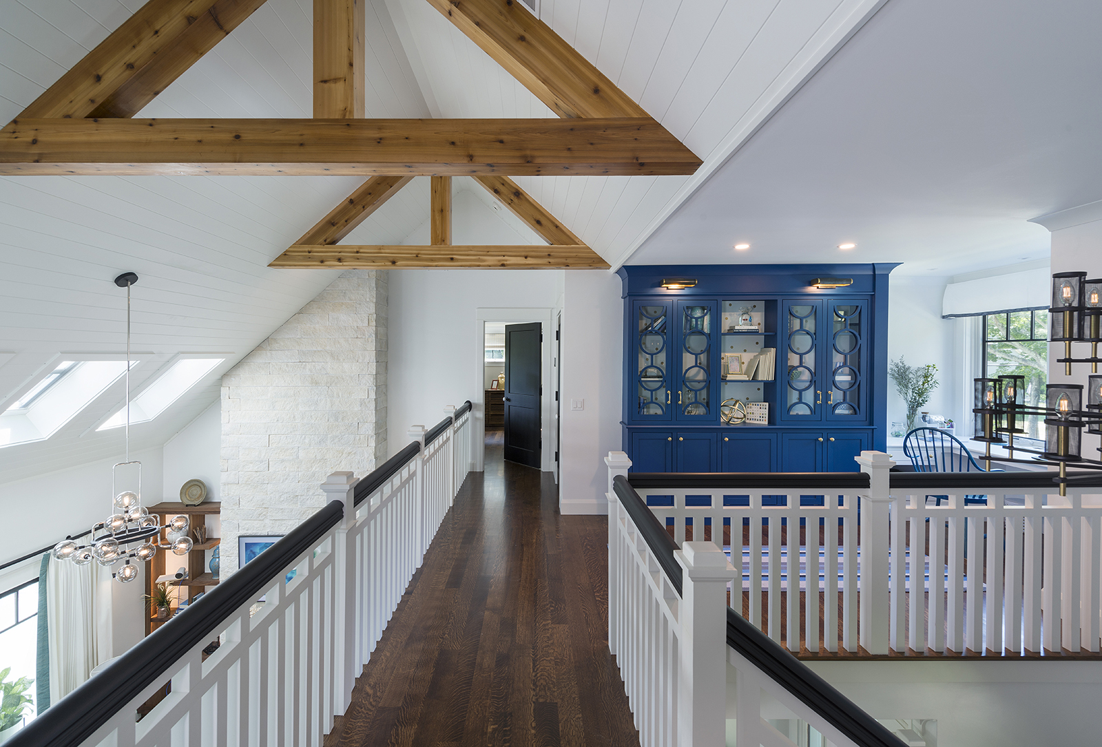
As we continue to layer design elements, there may be too many “favorite” items for me to count. I love the clean lines of the Hayneedle furniture in living room and dining room. They combine color and natural textures to create a space that is both durable and polished. I also love the O&G chair in the library which combines old world craftsmanship with a modern look. The Tech Lighting pendant in the living room is another favorite. And I adore many of the design accents like the ceiling wallpaper in the powder room, the old-fashioned tile patterns in the pantry and laundry rooms, and the sleek under counter lighting in the first-floor master bath.
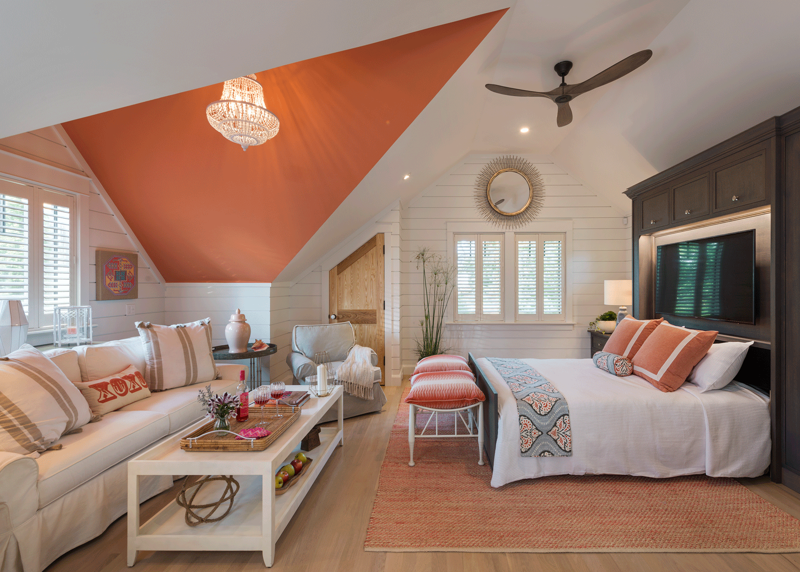
Finally, I would be remiss not to mention the guest suite above the garage, which I’ve started to call the “she shed” because it’s so easy for me to imagine myself escaping there for a moment of relaxation! One of the fun aspects of designing it was taking inspiration from the beach nearby without leaning on a blue color palette.
To see the full article, and shop the look, click here.
About the 2018 Idea House:
This Old House teamed up with Sweenor Builders for a second time to build the one-of-a-kind home on Robinson Street in Narragansett’s historic pier. The is the fourth annual Idea House from the trusted home renovation brand to showcase the from-the-ground-up building process with innovative products and how-to instruction that home enthusiasts can incorporate into their own remodels and new-builds. Designed by the award-winning, Providence-based Union Studio Community Architecture & Design, the 2,700-square-foot cottage has classic Craftsman-style curb appeal and modern looks inside. Located less than a mile from the town beach, it epitomizes what buyers are looking for today: a smaller home that lives large in a tight-knit neighborhood, plenty of bespoke built-ins, luxury amenities including a home gym, dedicated media room and butler’s pantry, and an easy-care backyard designed for “staycation” living. Kristen Martone, Sweenor’s in-house designer and owner of Graceke Design, led Interior Design for the project. To learn more about the project, visit our portfolio or This Old House.


